The Birth of a Design System
Leading the creation of a scalable design system for a well-known brand—driving consistency, speed, and team-wide buy-in.
Leading the creation of a scalable design system for a well-known brand—driving consistency, speed, and team-wide buy-in.
Laithwaites faced a fragmented digital ecosystem with 17 inconsistent, disconnected websites that lacked visual cohesion, unified branding, and scalable design infrastructure across regions.
When I joined Laithwaites, the company was running 17 transactional websites across the UK, US, and APAC. On paper, they were all part of the same business — but visually and structurally, they looked like they came from different planets.
The digital product team was newly formed in response to a major technical shift — moving away from a legacy ATG monolith toward a modular microservices architecture. This transition created a need for a modernised design function: one that could support scale, elevate user experience, and build the right foundations for a platform future.
Each site had its own disconnected design, its own way of handling components, and in many cases, even inconsistent branding within the same brand. Users wouldn’t have known they were shopping with the same company
.png)
The digital product teamwas newly formed in response to a major technical shift - moving away from a legacy ATG monolith toward a modular microservices architecture. This transition created a need for a modernised design function: one that could support scale, elevate user experience and build the right foundations for a future platform
When I joined, there were multiple assets floating around under the name “design system.” In reality, none of them were systems — they were visual style guides at best, and incomplete moodboards at worst.
The Creative Team, responsible for campaign and landing pages, worked in InDesign and Creative Cloud, creating layouts that weren’t responsive and couldn’t be reused.
An external brand agency, had delivered a series of static components and hex values in Figma, but with no tokens, logic, or interaction states.
The digital creative team internally had compiled UI files with inconsistent naming, duplicated components, and unclear usage rules.
A US agency was brought in to help build a new “design system,” particularly to support US markets — but their output resembled a branded style library, not a product-ready design infrastructure.
.png)
When I joined, the Product Listing Page (PLP) and Product Detail Page (PDP) journeys were already underway — but they were being designed without any system in place.
There were no components, no responsive logic, no structure around colour, type, or layout. It was a well-meaning but junior team, working in isolation, without process, ownership, or direction.
To avoid derailing those high-priority projects, I moved quickly. I created a tactical, internal framework called LDX, based on Atomic Design principles. It wasn’t polished — and it wasn’t meant to be. It was a functional scaffold to support immediate delivery while beginning to expose the mess beneath: duplicated styles, inconsistent naming, orphaned components, and clashing design decisions.
LDX wasn’t just a tidier file — it made the design landscape visible. And that visibility was the first real step toward alignment.

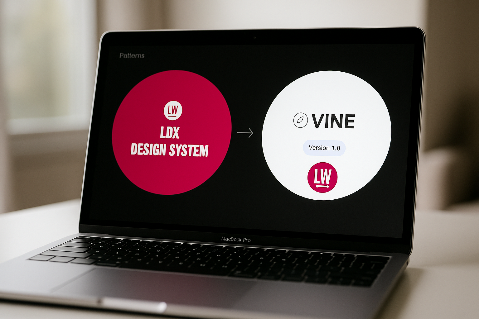
We started with LDX, a lightweight stopgap system I created out of necessity. At the time, there was no design systems team — no dedicated resource at all, just a small design crew trying to deliver PLP, PDP, and Basket journeys across three major markets.
LDX let us move fast. It wasn't perfect, but it gave us just enough structure to stay consistent and efficient while shipping critical work.
Once those core experiences were live, I brought on a Senior UI Designer, and together we took everything we’d learned from LDX — what worked, what didn't — and evolved it into VINE, our fully scalable, brand-flexible design system.

Create a unified system that could flex across 17 transactional sites by using variables to swap branding — enabling shared logic across the UK, US, and APAC while still respecting individual brand nuance.
Establish a modular design system rooted in consistent behaviors and robust components — simplifying complexity, eliminating duplicate styles, and making the system easier to maintain across teams.
Reduce component sprawl, add clear usage guidelines, and ensure best practices around accessibility, responsiveness, and UX consistency — so teams could move faster with confidence, regardless of market.
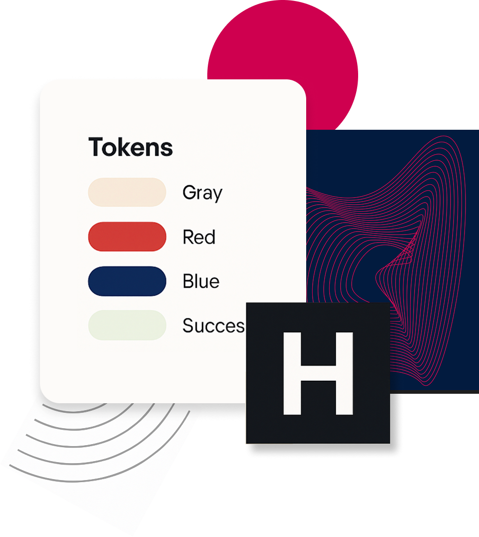
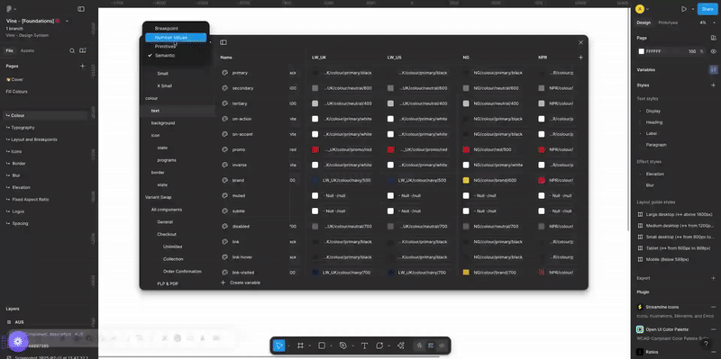
When we inherited the existing visual styles, we quickly uncovered a recurring issue: color had no system.
Every market had multiple primaries, undefined secondaries, arbitrary accents, and even duplicated styles — all without clear usage rules.
There was no semantic color structure, no system for interaction states, and no scalable way to apply consistent tints or themes across brands.
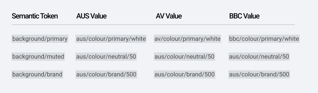
✅ Semantic Roles, Not Visual Names
We replaced hardcoded hexes and abstract labels with semantic tokens like primary, on-surface, hover, background/brand, and text/muted.
✅ Primitives + Themes + Variables
We introduced brand-specific primitives (e.g. AUS/colour/neutral/100), layered with semantic variables that mapped to the right primitive per market. Designers now style components using logic, while brands can easily switch visuals via Figma variable modes.
✅ Mathematical Shade Structure
Each core color had 10 shades generated programmatically (light to dark). This ensured hue consistency, reduced design debt, and created predictability in how colors behaved in UI elements (e.g. hover, disabled, active).
✅ Shared State Layer
We built a neutral and accessible set of state colors — for info (blue), error (red), warning (orange), success (green) — applied consistently across brands, including future scenarios like memberships or promotions.
.png)
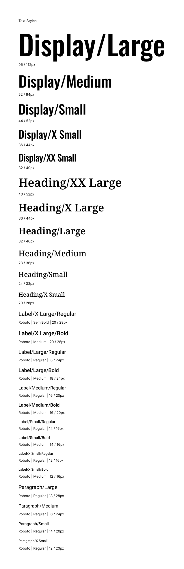
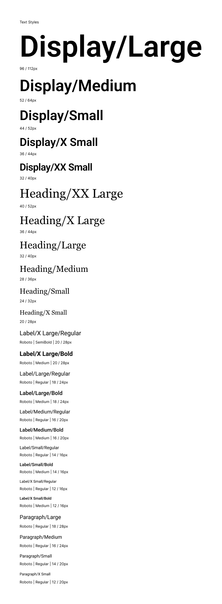
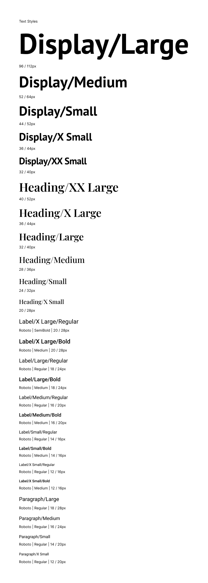
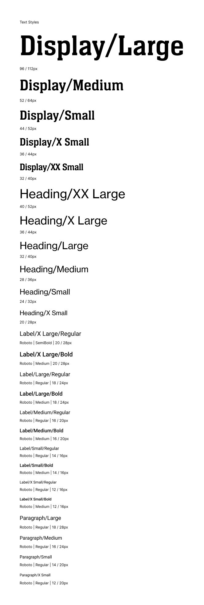
Before Vine, our typography lacked cohesion. Each brand had developed its own set of styles independently, without shared logic, structure, or design standards.
What emerged was a fragmented system with inconsistent patterns and no clear guidance — leading to a range of critical issues:
✅ Semantic Roles, Not Visual Names
We replaced hardcoded hexes and abstract labels with semantic tokens like primary, on-surface, hover, background/brand, and text/muted.
✅ Primitives + Themes + Variables
We introduced brand-specific primitives (e.g. AUS/colour/neutral/100), layered with semantic variables that mapped to the right primitive per market. Designers now style components using logic, while brands can easily switch visuals via Figma variable modes.
✅ Mathematical Shade Structure
Each core color had 10 shades generated programmatically (light to dark). This ensured hue consistency, reduced design debt, and created predictability in how colors behaved in UI elements (e.g. hover, disabled, active).
✅ Shared State Layer
We built a neutral and accessible set of state colors — for info (blue), error (red), warning (orange), success (green) — applied consistently across brands, including future scenarios like memberships or promotions.