Laithwaites Product listing page
Global PLP - Iteration to success
About Laithwaites
Laithwaites is a leading direct-to-consumer wine retailer operating across three core markets: the UK, US, and APAC region. The company owns 17 transactional websites, enabling localized shopping experiences while maintaining a strong digital presence globally. Originally founded as a traditional wine merchant, Laithwaites has evolved into a major online wine retailer specializing in curated selections, subscription services, and direct delivery to customers.
ROLE
Digital Product Design Lead
PROJECT
LW, Avery's, BBC Good Food, WSJ, Omaha Steaks Wine, Australian Wines, TCM Wines
The Product Listing Page (PLP) Transformation
When I joined, the Product Listing Pages (PLPs) were in complete disarray. There was no cohesive strategy behind them, no consistent UX, and no shared understanding of what the PLP should be doing—let alone any design system to guide the work. Each market (UK, US, and APAC) had vastly different versions of the PLP, built in isolation, with no unified customer experience. We were effectively showing different storefronts to different users, which not only diluted the brand but made measurement and iteration incredibly difficult.
The Challenge

Lack of Design System Thinking
Designers assigned to the PLP had little experience, no prior systems thinking, and no reusable components.
No Pricing Logic
There was no consistent pricing logic or understanding of how different product types should behave
Fragmented Membership Models
Membership logic varied wildly. UK had Wine Plans and mixed cases, the US had a membership subscription model, and APAC had their own offers and region-specific messaging.
No Pricing or Tag Source of Truth
No source of truth for pricing structures, product tags, or CTA logic.
No Historical Data or Tracking
Old PLPs had no tracking. We couldn’t compare new performance to old accurately because the data didn’t exist.
Inconsistent Layouts
Our PLPs displayed inconsistent layouts—with some markets using grid, some list, some combinations of both. The list view in particular mirrored the PDP in detail and served no purpose.
Fragmentation Across Regions
- UK: Offered both list and grid views, often overwhelming users with repeated content. Visual hierarchy was unclear. Calls to action were inconsistent.
- US: Used completely different product cards, different CTAs, different logic for discounting and badges. Components weren’t reused.
- APAC: Showed promotional overlays and hard-coded banners that broke responsiveness.Even basic components like product cards had multiple live variants across markets. None of them aligned with each other.
First iteration
Our first challenge was alignment — not with users, but with internal stakeholders. UX best practices weren’t yet part of the conversation. Business expectations centered around one thing: show everything. Every offer, membership saving, bottle count, per-bottle pricing, mix-and-match logic, and more had to fit into a single product card. The result was a visually dense, high-cognitive-load layout.
What we improved

Centralised design via LDX
We launched the new PLP using LDX, Laithwaites’ central design system. That meant consistent tokens, type rules, spacings, and patterns — making scale and iteration faster, easier, and more reliable.
First global launch
For the first time in the company’s history, we launched one unified Product Listing Page across all three core markets — the UK, US, and APAC — with custom content per sub-brand but a consistent underlying architecture. That meant a single codebase, shared analytics, and aligned future strategy.
Information grouping
Instead of scattering elements across the card (as seen in the old PLP), we started grouping content logically — deal details together, pricing info in one block, etc. This reduced scanning effort without “removing” anything.
Hierarchy and typography
We used font weight, color, and spacing to create clearer visual hierarchy. Old product cards treated all text equally — we made key actions (like "Add to Basket") stand out more.
Card consistency
Legacy cards varied in layout depending on the offer. We introduced consistent card structures, so users didn’t have to relearn the layout each scroll.
Mobile improvements
The new mobile layout showed clear gains in conversion — not because it was prettier, but because it was usable. Button tap targets were clearer, text wrapped properly, and users could actually see the wines.
Second iteration
After launch, we held a lessons-learned retrospective and conducted a detailed review of what we had built compared to what was actually required. We incorporated feedback from real users, analysed performance data from Adobe Analytics, and examined research across different markets. This process led us into multiple rounds of user testing focused on simplifying the experience.
.svg)
We quickly identified that the right way forward wasn’t to keep designing in bulk—page after page—but to understand the journey of a product. So we audited the full buying journey across all touchpoints.
(Insert link or image of buying journey audit here)
To support this shift, we also redefined how we gathered requirements, using a microinteraction mapping approach. This helped us align with PMs and stakeholders on what matters most, and reduce ambiguity in delivery.
(Read more about this approach here — link to other case study)
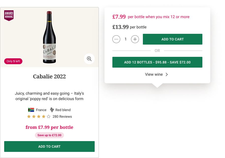
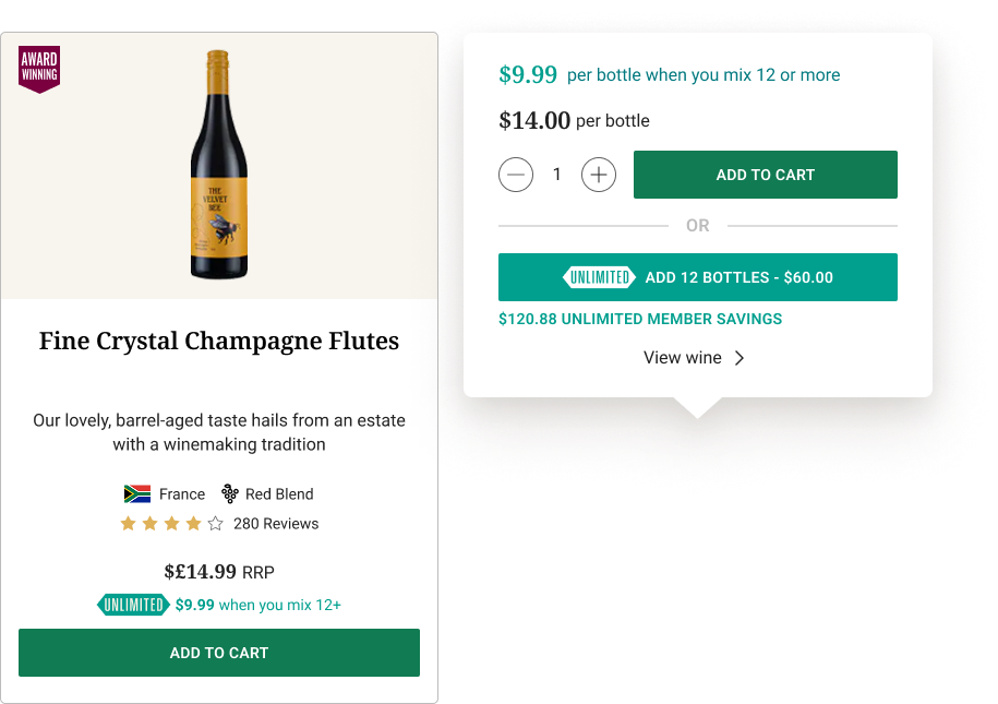
We started by asking what matters most on the PLP—the product card—and focused our efforts there first, knowing that everything else (filters, navigation, promos) would follow; then we asked what matters most on the card, and the answer was clear: adding to cart, especially in a bulk-buying model.
This first iteration brought clarity to pricing for all three markets—UK, APAC, and US—and resulted in a significant uplift across metrics. But while performance improved, the experience still carried too much cognitive load.
Users were zooming in to see the wine label clearly and often missed the zoom icon entirely. We responded by increasing image size and introducing a gallery experience with high-resolution labels shown in full view.
From FullStory reviews, we also noticed customers were “rage clicking” on the quantity selector. While it wasn’t true rage—just rapid repeated clicks—the pattern revealed a UX gap: users didn’t realise they could click inside the selector to type a quantity. This led to a redesign of the selector, making it explicit and easier to understand.
After multiple rounds of user testing, benchmarking and with these improvements in mind, we set out to simplify further.
Interact with the prototype
For mobile please resize your browser

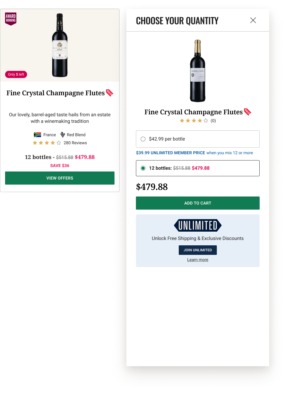
One of the biggest friction points was the bulk buying logic—we wanted users to buy more bottles, so we showed them every possible volume option up front. That left customers confused, overwhelmed, and unsure where to look first.
We ran a tree test, asking users to rank card elements in order of importance for purchase. It confirmed what we suspected: users didn’t need everything. They needed clarity.
We then stripped the card back to essentials: One clear price, one primary action, additional options shown progressively.
.png)

.svg)


.svg)