
Laithwaites
Homepage
Unifying product experiences through scalable,
human-centered design.
human-centered design.
.jpg)
Laithwaites is a leading direct-to-consumer wine retailer operating across three core markets: the UK, US, and APAC region. The company owns 17 transactional websites, enabling localized shopping experiences while maintaining a strong digital presence globally. Originally founded as a traditional wine merchant, Laithwaites has evolved into a major online wine retailer specializing in curated selections, subscription services, and direct delivery to customers.
.png)
The Laithwaites homepage project was a foundational redesign initiative aimed at modernising the customer-facing landing experience. Unlike other UI refreshes, this was conceived as a scalable framework — designed to empower the Creative and Content teams to own and operate the page post-launch without dependency on developers.
The homepage is a high-velocity space, updated weekly to reflect campaigns, offers, and seasonal storytelling. This meant modularity, ease-of-use, and brand consistency were critical — not just for customers, but for internal publishing teams as well.

Ensure customers instantly understand Laithwaites’ range and value proposition by introducing intuitive navigation and visible category signposting.
Surface legacy cues, awards, and guarantees early in the experience to build trust and emotional connection with first-time visitors.
Build a flexible, modular homepage structure in Contentful to empower the Creative and Content teams to publish independently and at pace.
Use a systemised design approach to unify visual storytelling, eliminate patchwork campaigns, and create a coherent brand narrative across all homepage updates.
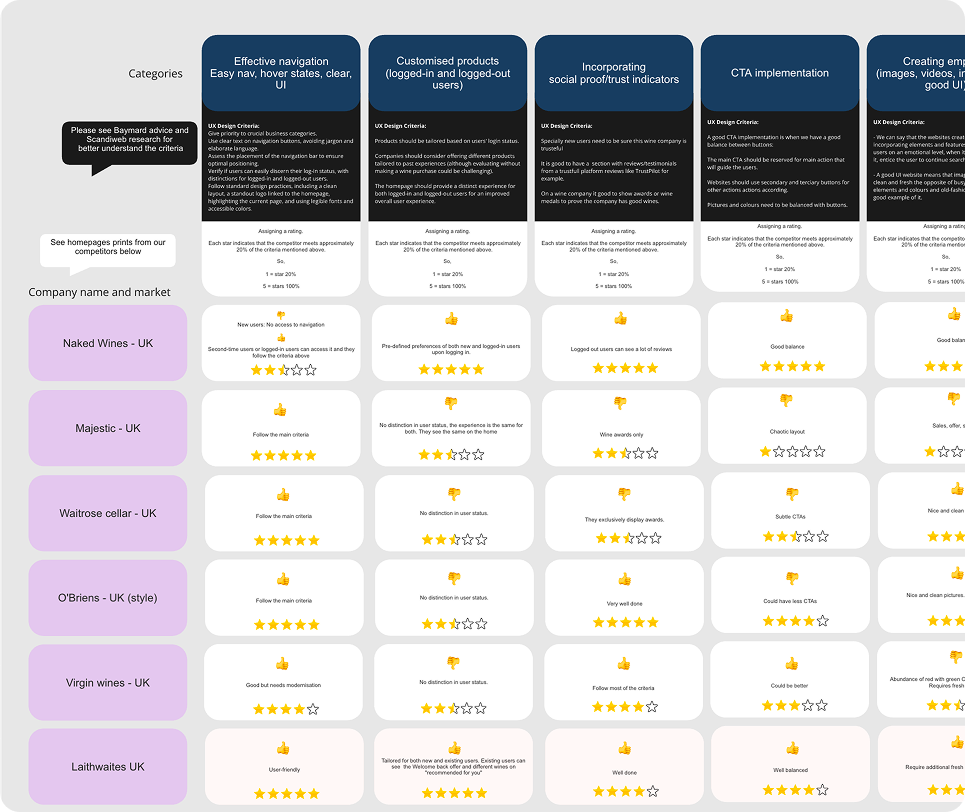
This redesign was built on a deep foundation of research, drawn from diverse sources and user insights. We pulled together existing knowledge, commissioned audits, and collected first-hand feedback across three key markets — UK, US, and Australia. H
Core UX principles like clarity, scannability, and trust signposting informed early design hypotheses. We took particular note of Baymard’s advice to minimise first-fold noise and ensure strong visual hierarchy.
.png)
.png)
.png)
.png)

We reviewed analytics across ~63,000 user sessions from UK, US, and AU — broken down by new vs. returning user, device type, and engagement hotspots. Key insights:
Armed with a clear set of priorities from our research, we began sketching a prototype for what would eventually become the new Laithwaites homepage. Instead of jumping straight into high-fidelity mockups, we developed a V0 wireframe — a low-res conceptual layout aimed at validating structure, flow, and hierarchy.
We used AI-assisted prototyping tools to rapidly generate variations of the homepage layout based on different regional user behaviours. This early version helped us simulate how returning vs. new users might scan, interact with, and engage with each section.
The V0 prototype was used to align with key stakeholders across Product, Content, and Brand. Their feedback led to adjustments around campaign visibility, trust marker placement, and the prominence of “Our Range” links. Once this wireframe received buy-in, we moved forward with full design execution.
he approved wireframe then formed the foundation for the final design system. Every section in the homepage — from hero banners to product carousels — was reimagined as a modular, interchangeable component. These were built in Figma and later integrated into Contentful and VINE for real-world use.
Each component followed clear rules around spacing, hierarchy, and responsiveness. Importantly, we designed the layout to be non-linear and flexible, allowing the Creative and Content teams to reorder or swap out modules based on seasonal priorities or campaign objectives — without breaking structure or flow.
Since launch, this new homepage template has been adopted across multiple Laithwaites markets, serving as the foundation for a shared approach to homepage design — one that's both scalable and contextually adaptable.
.jpg)
These results reflect performance 19 days post-launch, a period where behavioural shifts typically begin but haven't yet stabilised. Despite this, early signs were promising: Average Order Value rose by 7.4% to £109.26, Bounce Rate dropped by 11.5%, and Sales increased by 2.5%, adding over £19.6K in revenue. While conversion dipped slightly by 4.6%, it held steady at 16% — a strong outcome given the scale of structural change. Visits remained flat, confirming no disruption to traffic. Overall, the data validated our design hypotheses: clearer hierarchy, modularity, and trust cues led to stronger engagement and commercial lift.


Since the homepage redesign, ongoing analytics show that performance has held steady. There have been no major drops in traffic, engagement, or conversion, despite new campaigns being layered in weekly by non-technical teams. This confirms not just the success of the design itself, but the effectiveness of the modular system we implemented — allowing flexibility without sacrificing user experience. Internal teams have now adopted the homepage framework as a standard template, and performance trends continue to reflect healthy usage patterns across markets.

Creative and Content teams now build and launch homepage campaigns directly in Contentful using pre-built, on-brand modules — no designer or developer support required.
We created a fully modular design system with interchangeable components that scale effortlessly across markets and campaigns.
Design choices were guided by user testing, analytics, A/B testing, and expert audits — ensuring every improvement was purposeful and user-centric.
Post-launch metrics showed stronger AOV, reduced bounce rates, and increased revenue — validating both the layout strategy and underlying system.
The homepage template is now live across the UK, US, and AU, allowing regional customisation while preserving structure and brand alignment.
This project set the standard for Laithwaites’ digital evolution — creating a shared framework that improves velocity, consistency, and cross-team collaboration.