Laithwaites Basket
Global Basket / Cart - Some subtitle
Laithwaites is a leading direct-to-consumer wine retailer operating across three core markets: the UK, US, and APAC region. The company owns 17 transactional websites, enabling localized shopping experiences while maintaining a strong digital presence globally. Originally founded as a traditional wine merchant, Laithwaites has evolved into a major online wine retailer specializing in curated selections, subscription services, and direct delivery to customers.
.png)
The Laithwaites basket project was a critical UX and system upgrade focused on refining one of the most conversion-sensitive parts of the customer journey. Unlike minor UI lifts, this was a structural and behavioural rethink — designed to simplify the experience, reduce bounce, and make the checkout path more seamless across devices.
Our basket had grown fragmented over time, with inconsistent behaviour between desktop and mobile, unclear CTAs, and overlapping error states. This initiative tackled all of that, while also aligning the basket with our new frontend framework and design system.

Strip back unnecessary complexity, reduce steps, and remove blockers to improve clarity and focus across all breakpoints.
Identify friction points and fix high-abandonment triggers, especially around multi-line orders, unclear stock messaging, or cross-device drop-off.
Make layout, controls, and behaviour consistent across mobile and desktop — with full keyboard/screen reader accessibility.
Integrate new systems for mixed stock types (e.g. pre-order, out of stock, multi-warehouse) with clearer rules and warnings.
Structure the basket as modular components that fit within the broader design system, streamlining dev and design effort.
Redesign basket architecture to align with CommerceTools' capabilities — enabling a future-ready, decoupled solution that scales globally.
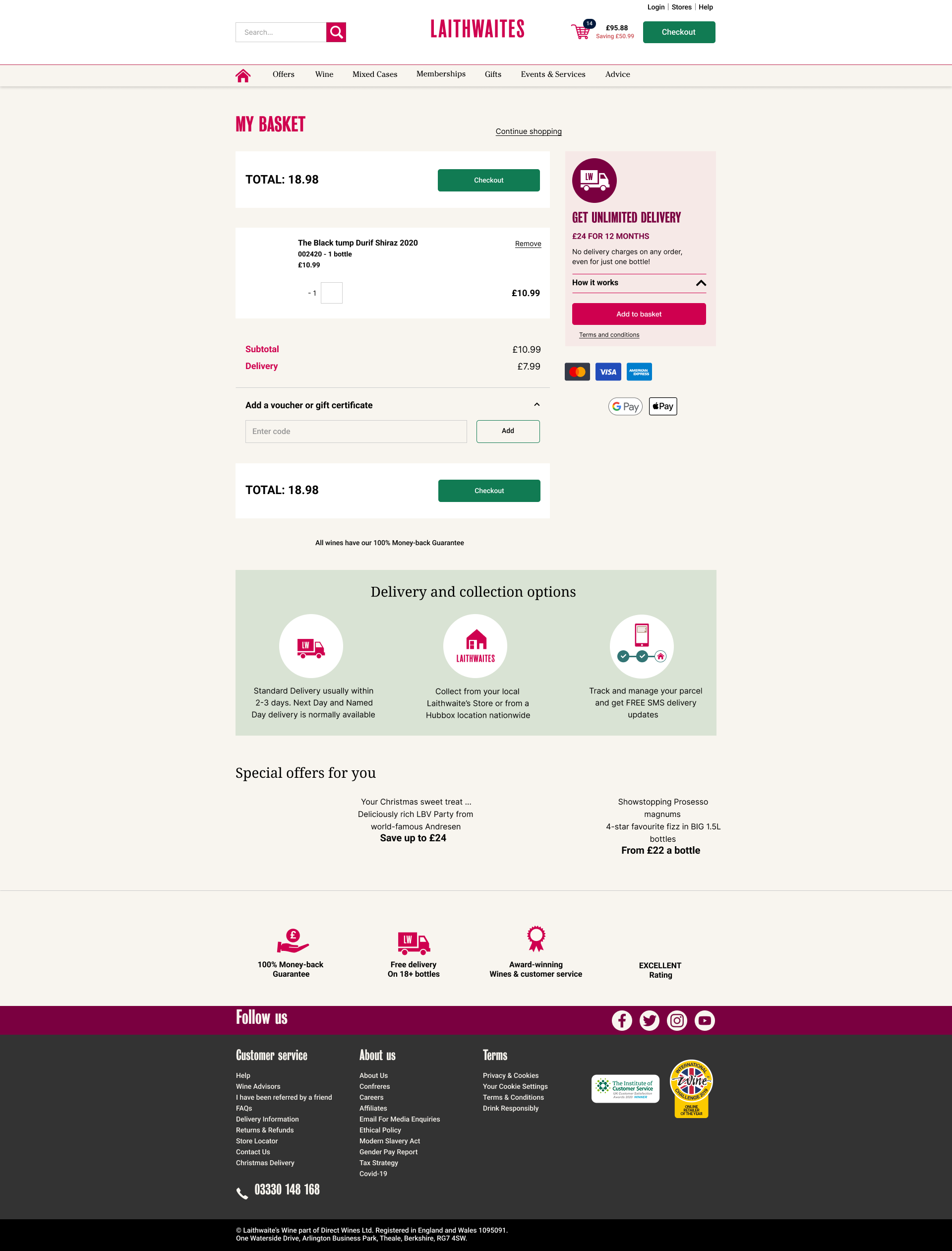
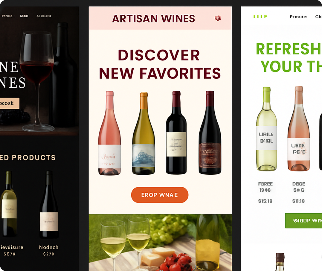
efore diving into the redesign of the basket, we began by auditing the existing experience (pictured here). While this layout had been functional for some time, it showed clear signs of age: cluttered UI, inconsistent hierarchy, and a lack of mobile responsiveness. It was also missing accessibility considerations and brand cohesion. This visual represents the original design we inherited—not something we created—but it provided a critical baseline for identifying pain points, technical constraints, and opportunities to align the experience more closely with modern ecommerce standards and user expectations.
This redesign was built on a deep foundation of research, drawn from diverse sources and user insights. We pulled together existing knowledge, commissioned audits, and collected first-hand feedback across three key markets — UK, US, and Australia.H
Core UX guidance from the Baymard Institute informed our earliest thinking — particularly around clarity of micro-interactions, visibility of basket access, and frictionless progress to checkout.
Their research highlights the importance of persistent mini-basket visibility, intuitive add-to-cart confirmations, and reducing “dead ends” after product actions.
.png)

We reviewed analytics across ~63,000 user sessions from UK, US, and AU — broken down by new vs. returning user, device type, and engagement hotspots. Key insights:


Rather than applying cosmetic changes, we approached the basket as a functional experience — rethinking hierarchy, visibility, and interaction across both mobile and desktop. Early findings shaped a structure-first approach, prioritising clarity, feedback, and ease of action.
We built out rapid wireframes to test layout logic and user flow, then moved into visual refinement. Key improvements included: surfacing key pricing information earlier, improving subtotal and CTA positioning, and ensuring product updates were clearly reflected post-interaction.
On mobile, we focused heavily on scannability and spatial awareness, ensuring that users could see what they added, understand the value, and move seamlessly to checkout. The final design brought visual clarity, consistency,
These results reflect performance 19 days post-launch, a period where behavioural shifts typically begin but haven't yet stabilised. Despite this, early signs were promising: Average Order Value rose by 7.4% to £109.26, Bounce Rate dropped by 11.5%, and Sales increased by 2.5%, adding over £19.6K in revenue. While conversion dipped slightly by 4.6%, it held steady at 16% — a strong outcome given the scale of structural change. Visits remained flat, confirming no disruption to traffic. Overall, the data validated our design hypotheses: clearer hierarchy, modularity, and trust cues led to stronger engagement and commercial lift.


Since the homepage redesign, ongoing analytics show that performance has held steady. There have been no major drops in traffic, engagement, or conversion, despite new campaigns being layered in weekly by non-technical teams. This confirms not just the success of the design itself, but the effectiveness of the modular system we implemented — allowing flexibility without sacrificing user experience. Internal teams have now adopted the homepage framework as a standard template, and performance trends continue to reflect healthy usage patterns across markets.

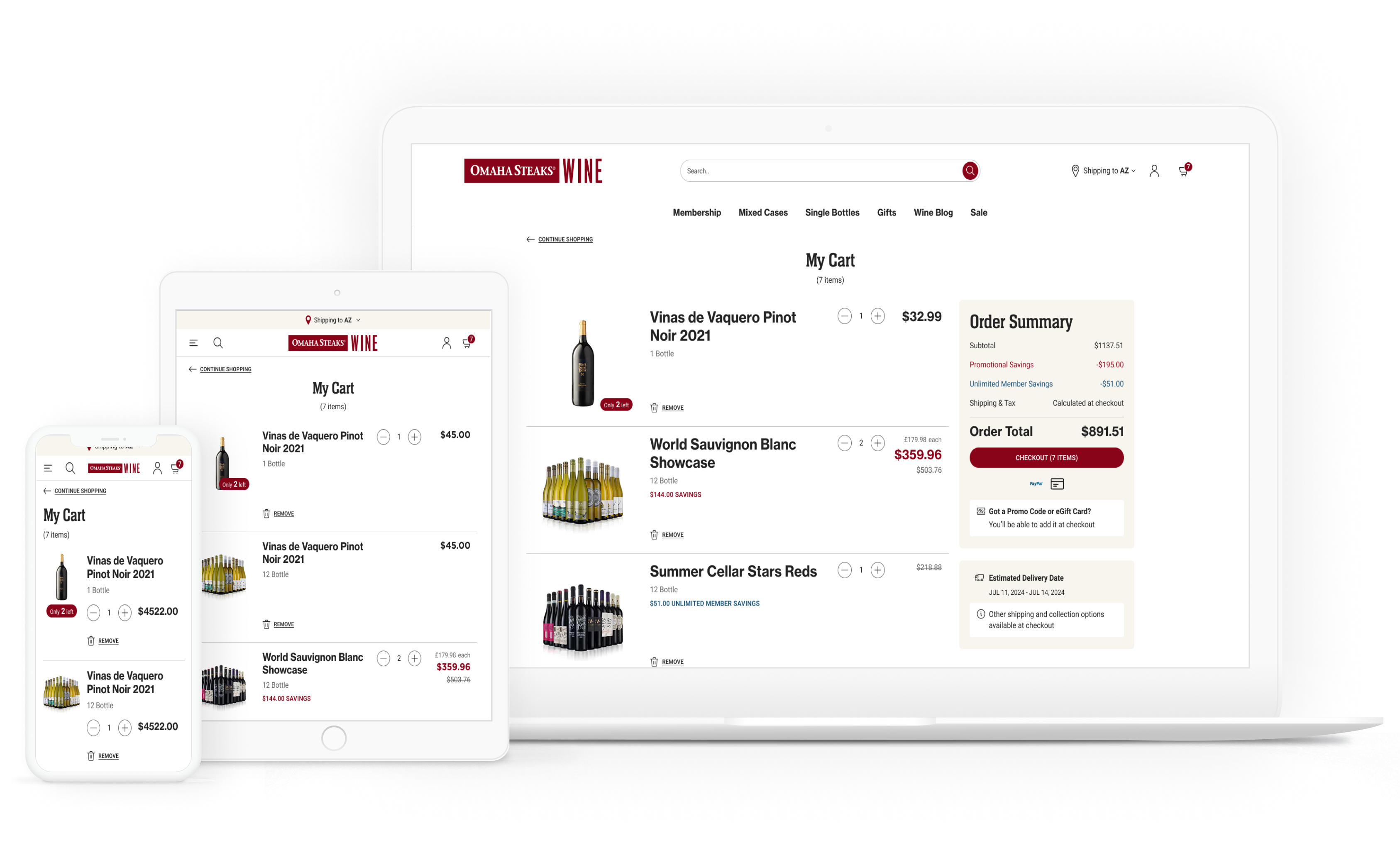
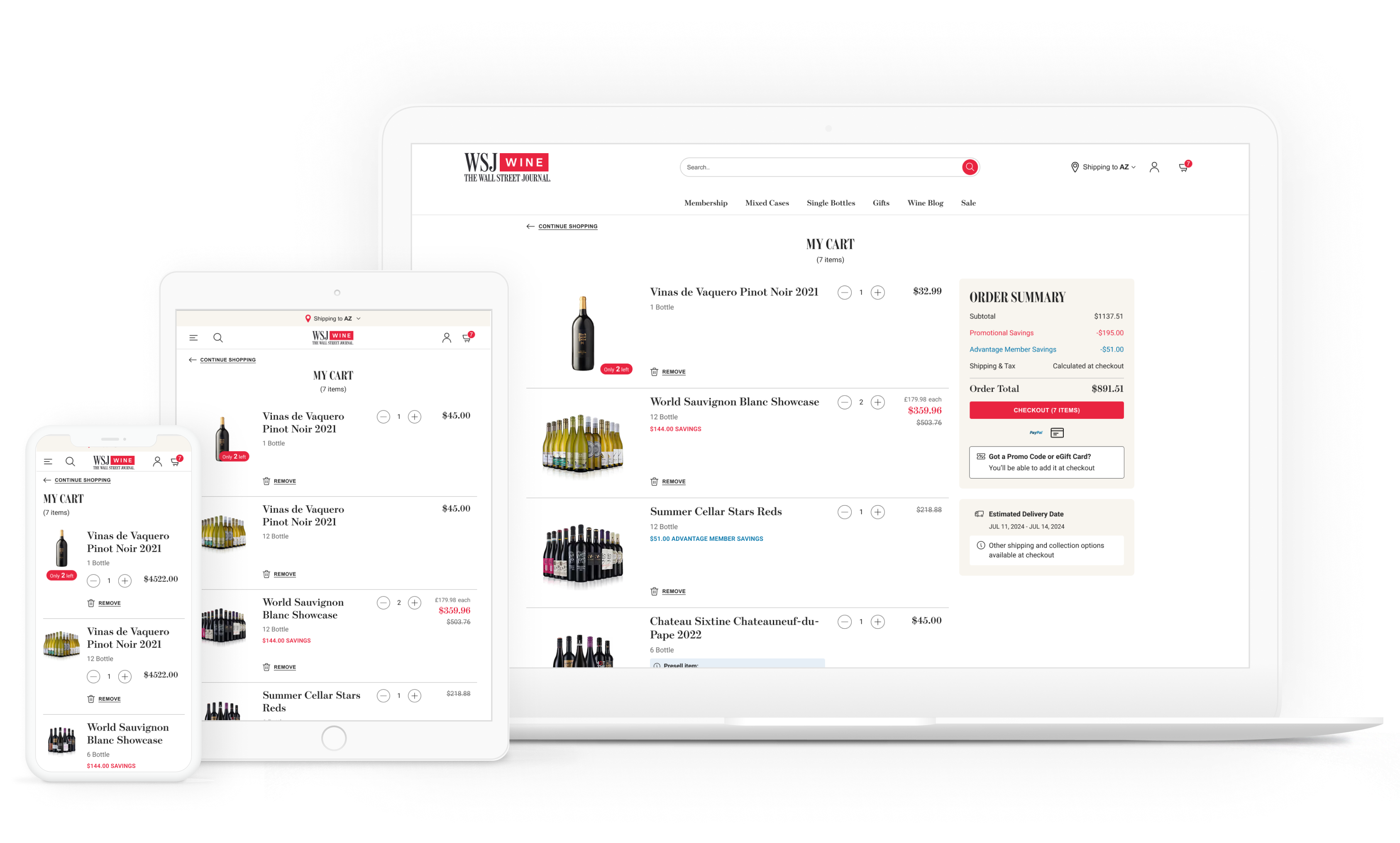
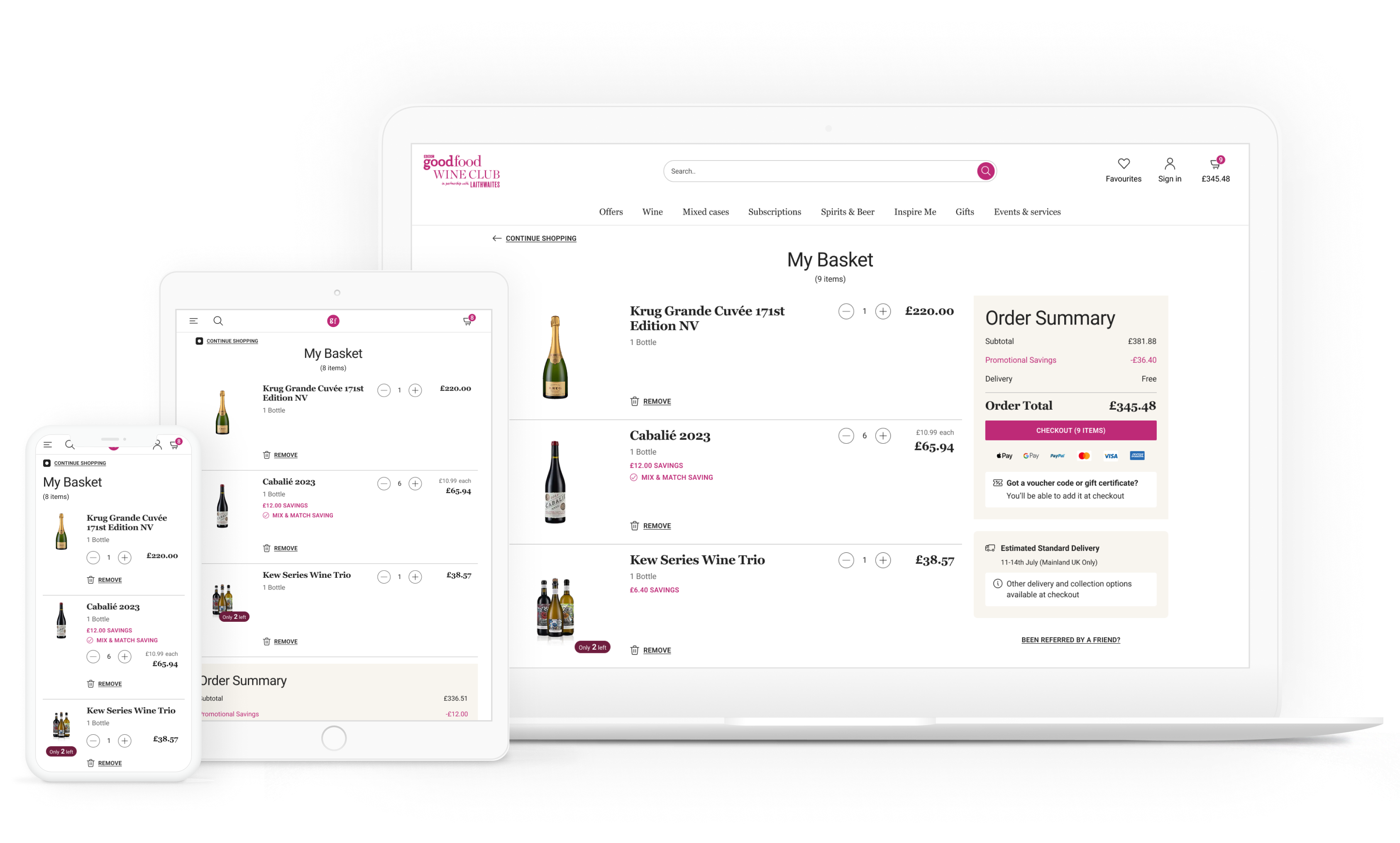
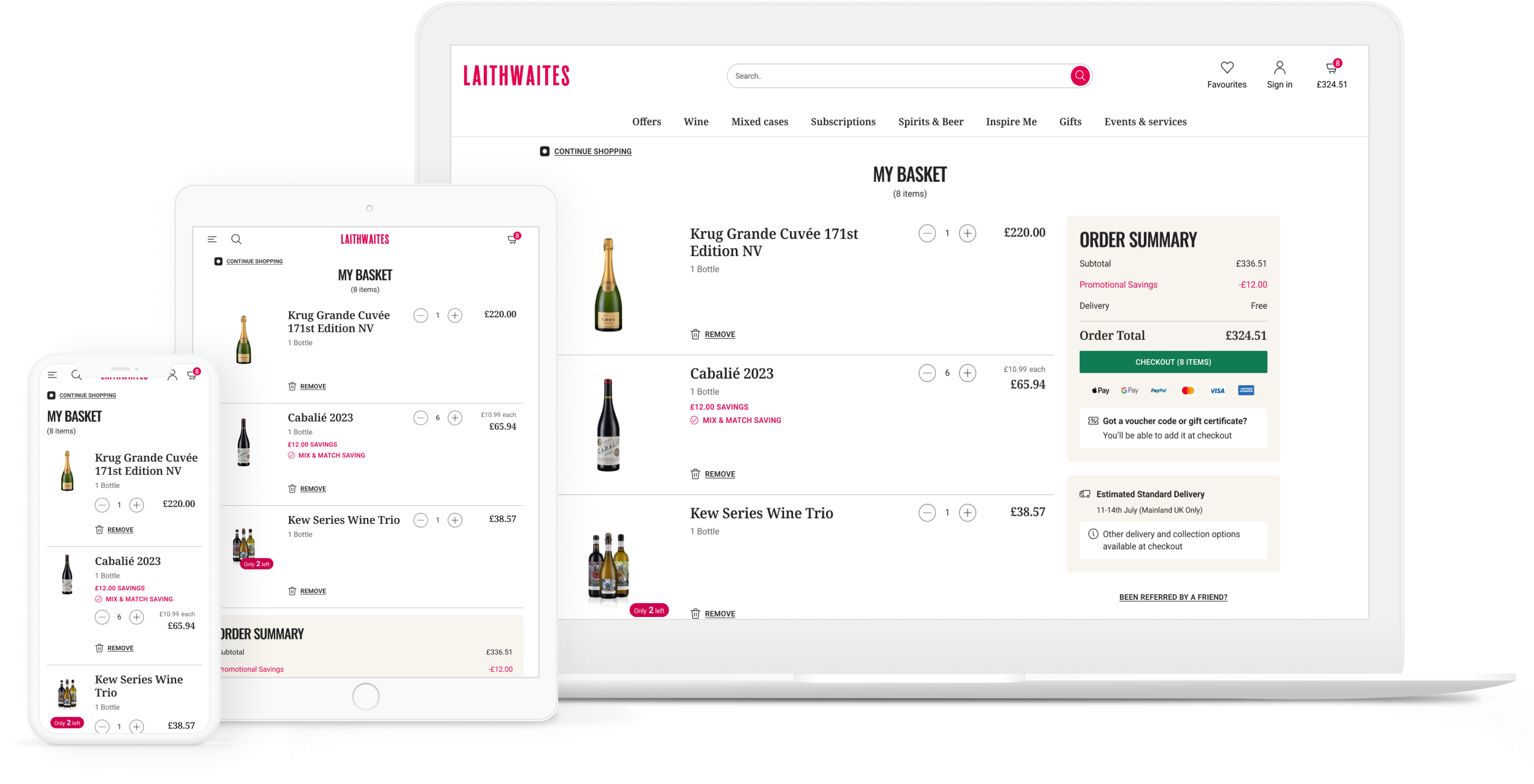
We unified previously fragmented carts across the UK, US, and AU into one cohesive global product, ensuring every user encounters the same streamlined and branded experience.
The interface was redesigned from the ground up with clarity in mind—introducing stronger layout hierarchy, better spacing, and visual simplicity aligned with our design system.
The new cart adapts seamlessly across devices, offering a smooth, intuitive experience whether on desktop, tablet, or mobile.
Customers are purchasing more items per order (+0.9 units), and those who add to their basket are significantly more likely to convert (+7.3pp), showing clearer intent and a more confident path to purchase.
Engagement with the cart is sharper: users are editing baskets more intentionally, with increased removal activity and focused interaction on quantity adjustments — all indicating a more streamlined decision-making process.
Interest in elements like Subscribe & Save and product information has held steady, and layout improvements (e.g., sticky summary) have enhanced usability, especially on desktop where users now reach key info with less effort.
.png)
.png)